In this project, my goal was to reimagine the concept of an everyday ice cream social and translate it into a vibrant brand experience. Drawing inspiration from the sheer delight of indulging in ice cream, I skillfully employed intriguing typography and a dynamic color palette that mirrors the joyous emotions evoked by this delightful treat. By infusing each design element with intention, I aimed to create a visual language that speaks to the essence of an ice cream social and resonates with people profoundly.
The Brand Identity: Rooted in intriguing typography and vibrant, eye-catching colors, the brand identity captures ice cream's sheer joy and excitement. Embodying two distinct meanings, the brand name "The Scoop" adds depth to the identity. Firstly, it signifies the classic notion of a scoop of ice cream, capturing that joy and excitement. Secondly, it symbolizes news or inside information, highlighting the brand's commitment to fostering meaningful conversations and connections. The typography choice adds a playful touch, while the bright colors mirror the uplifting emotions of savoring ice cream. This harmonious blend of elements celebrates the experience of indulging in ice cream while creating a memorable visual language for the brand.
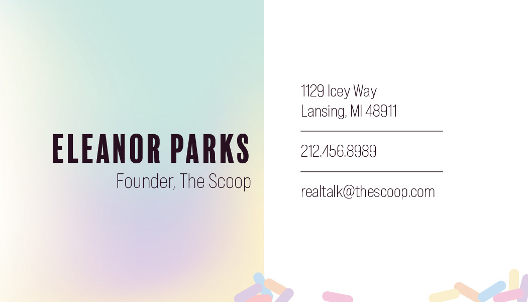
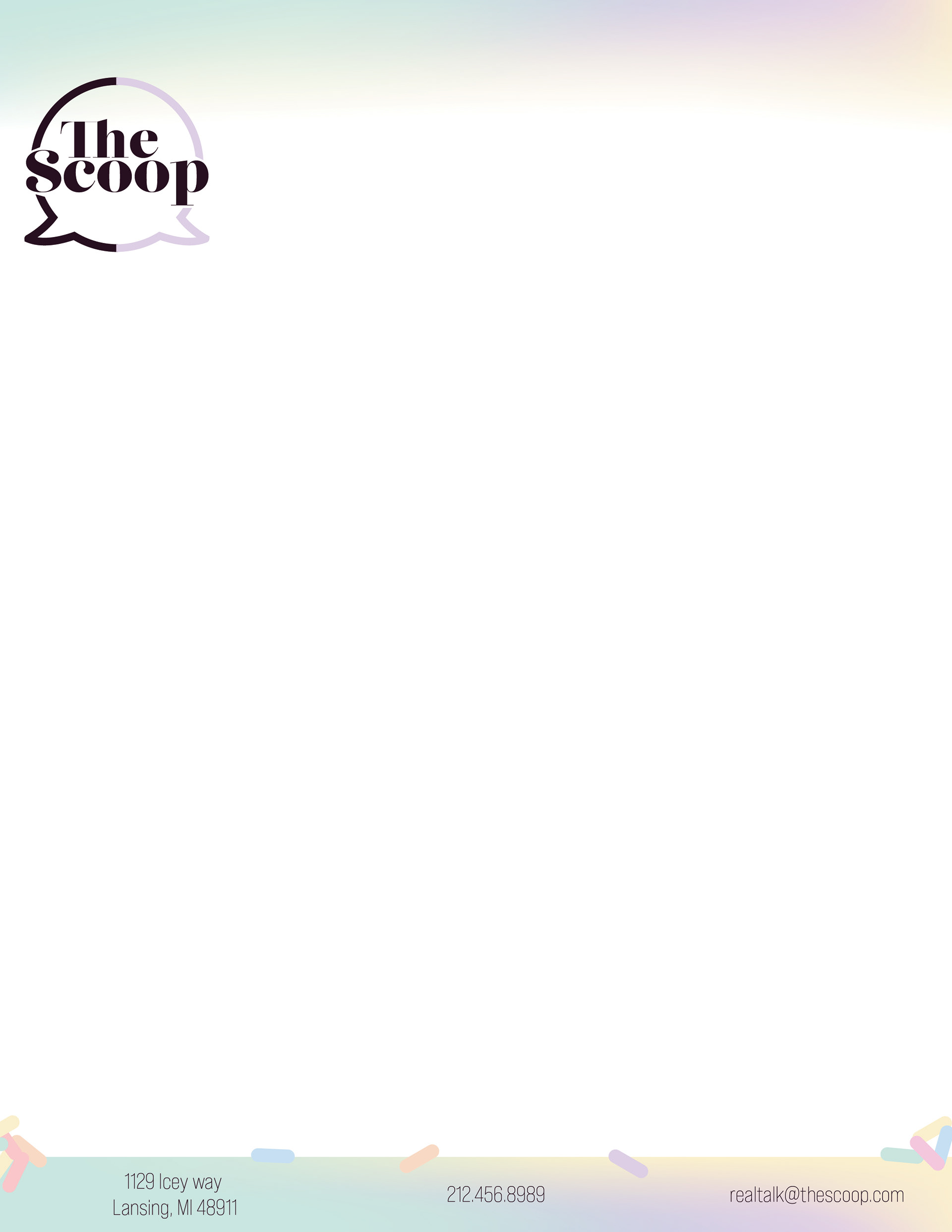
Stationery Design: The stationery design amplifies the brand's personality and reinforces its core values. From business cards to letterheads, each element showcases a captivating brand identity, leaving a lasting impression on customers and partners alike. The stationery embodies the community spirit, encouraging meaningful conversations and connections with every touchpoint.



Nacho Sundae Box: Fueling Conversations
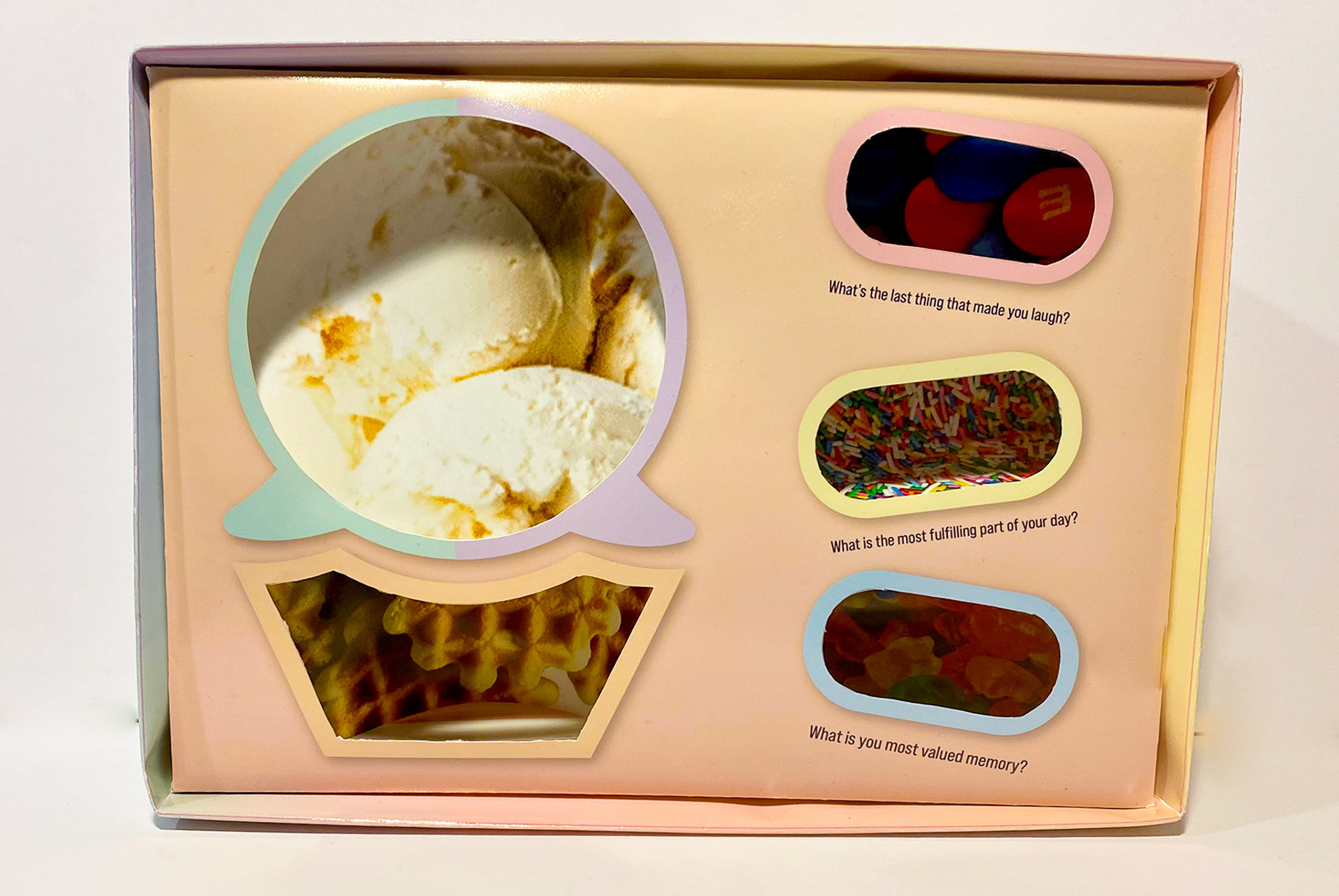
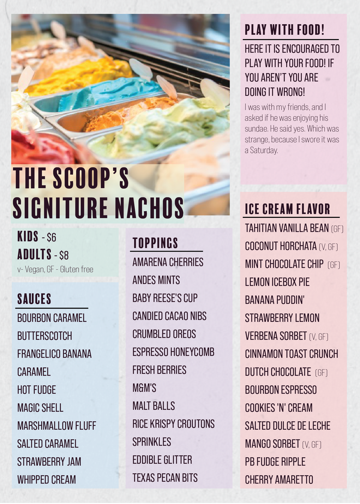
Taking innovation a step further, the Nacho Sundae Box offers customers a customizable experience. They select their waffle cone chips, a scoop of ice cream, and three delectable toppings. What sets this box apart is its clever design, incorporating conversation-starting questions. This interactive element adds depth to social interactions and creates memorable customer moments.
Taking innovation a step further, the Nacho Sundae Box offers customers a customizable experience. They select their waffle cone chips, a scoop of ice cream, and three delectable toppings. What sets this box apart is its clever design, incorporating conversation-starting questions. This interactive element adds depth to social interactions and creates memorable customer moments.


Print Ads: Creating Connections, One Scoop at a Time
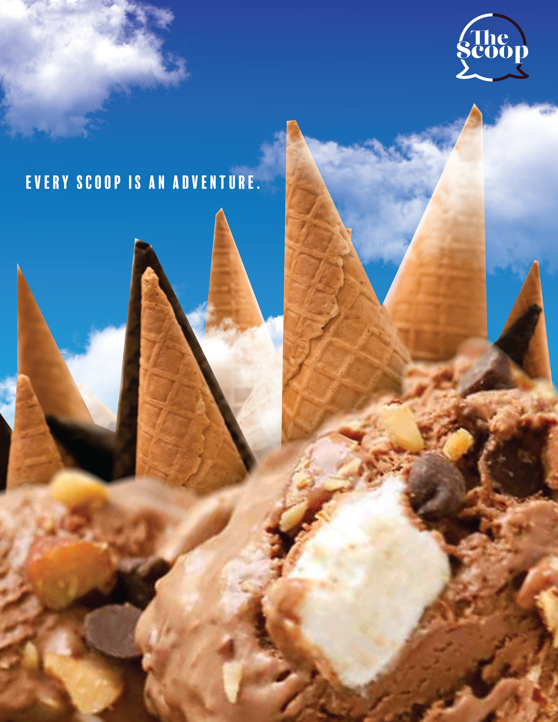
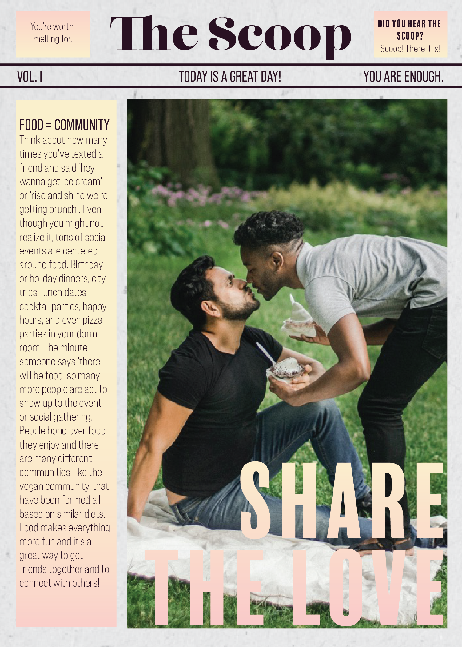
At the brand's heart, "The Scoop" is a haven for individuals seeking delicious ice cream, engaging in conversations, and sharing stories with strangers. The tagline, "Every scoop is an adventure," conveys the seamless integration of conversation and ice cream, emphasizing the importance of social connection in this unique ice cream experience.
At the brand's heart, "The Scoop" is a haven for individuals seeking delicious ice cream, engaging in conversations, and sharing stories with strangers. The tagline, "Every scoop is an adventure," conveys the seamless integration of conversation and ice cream, emphasizing the importance of social connection in this unique ice cream experience.

Menu: Unveiling the Art of Conversation
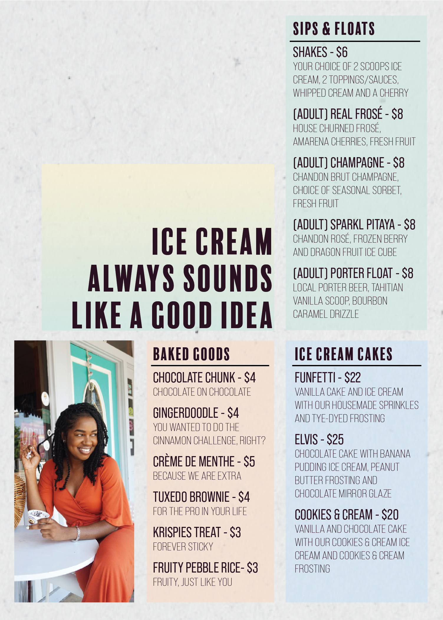
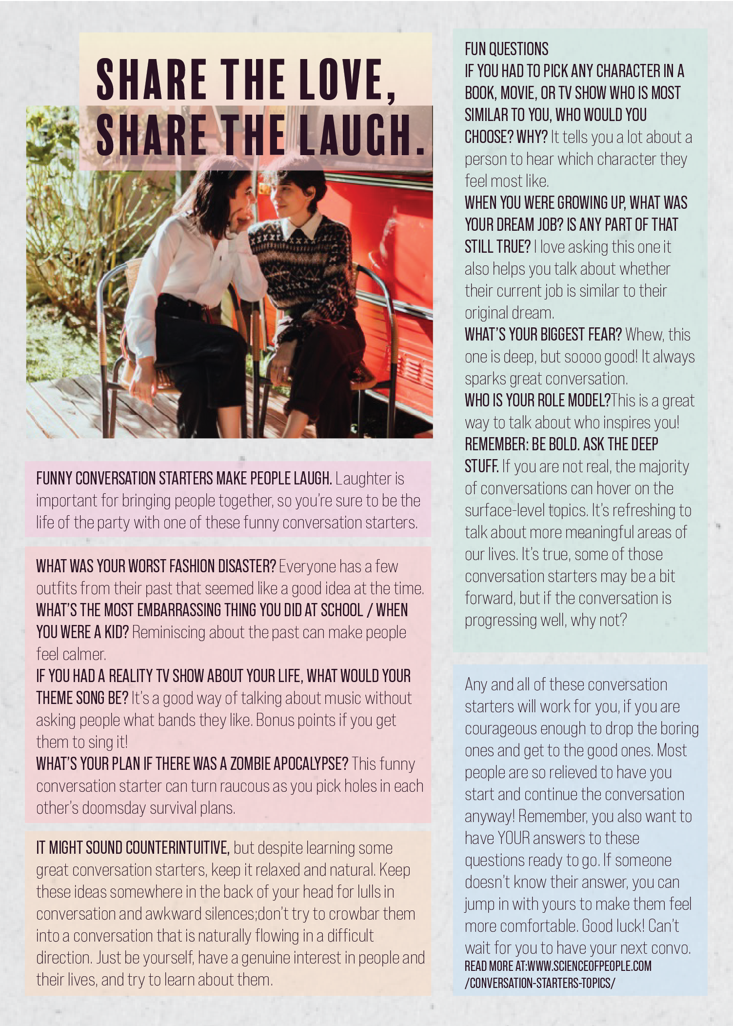
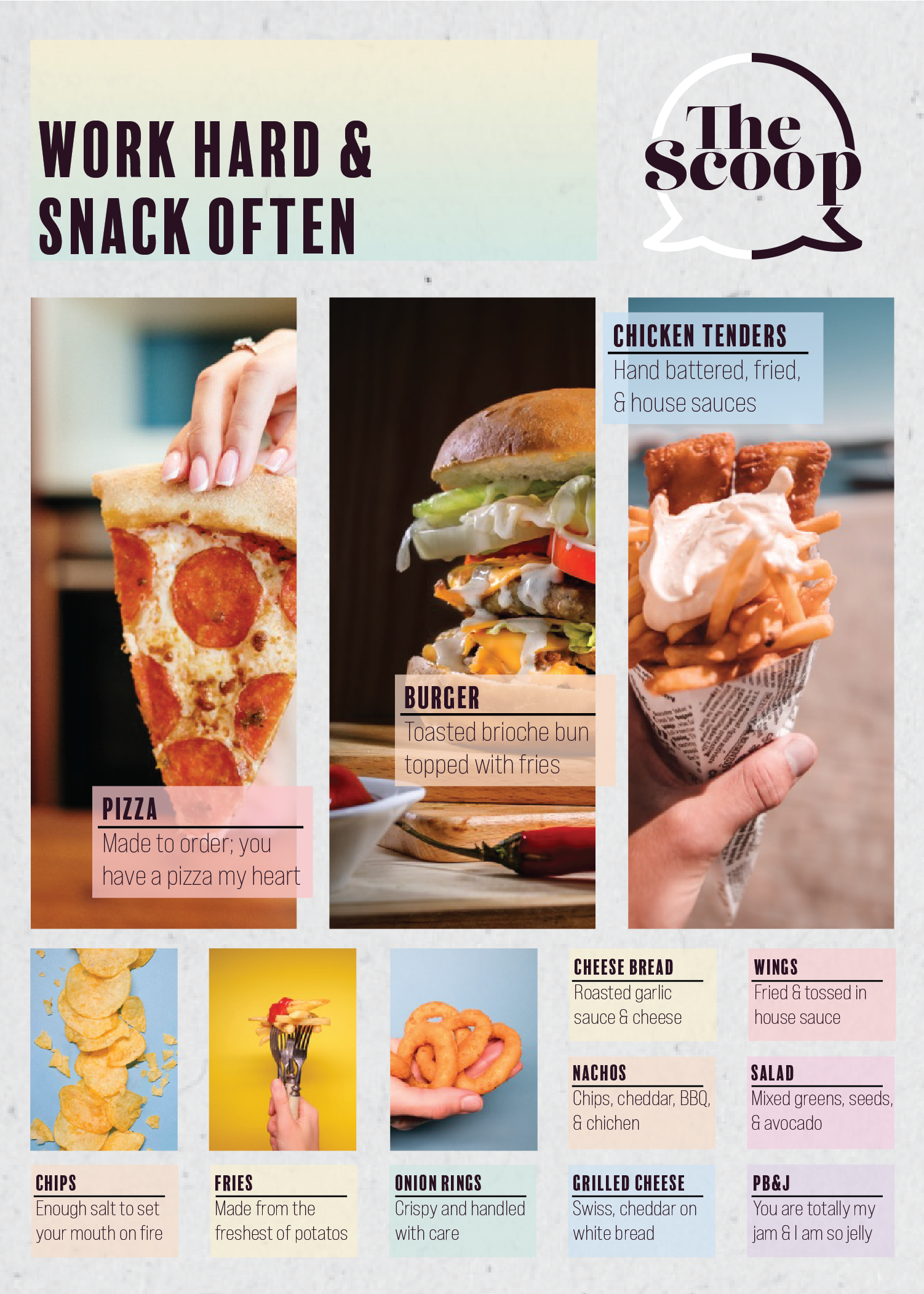
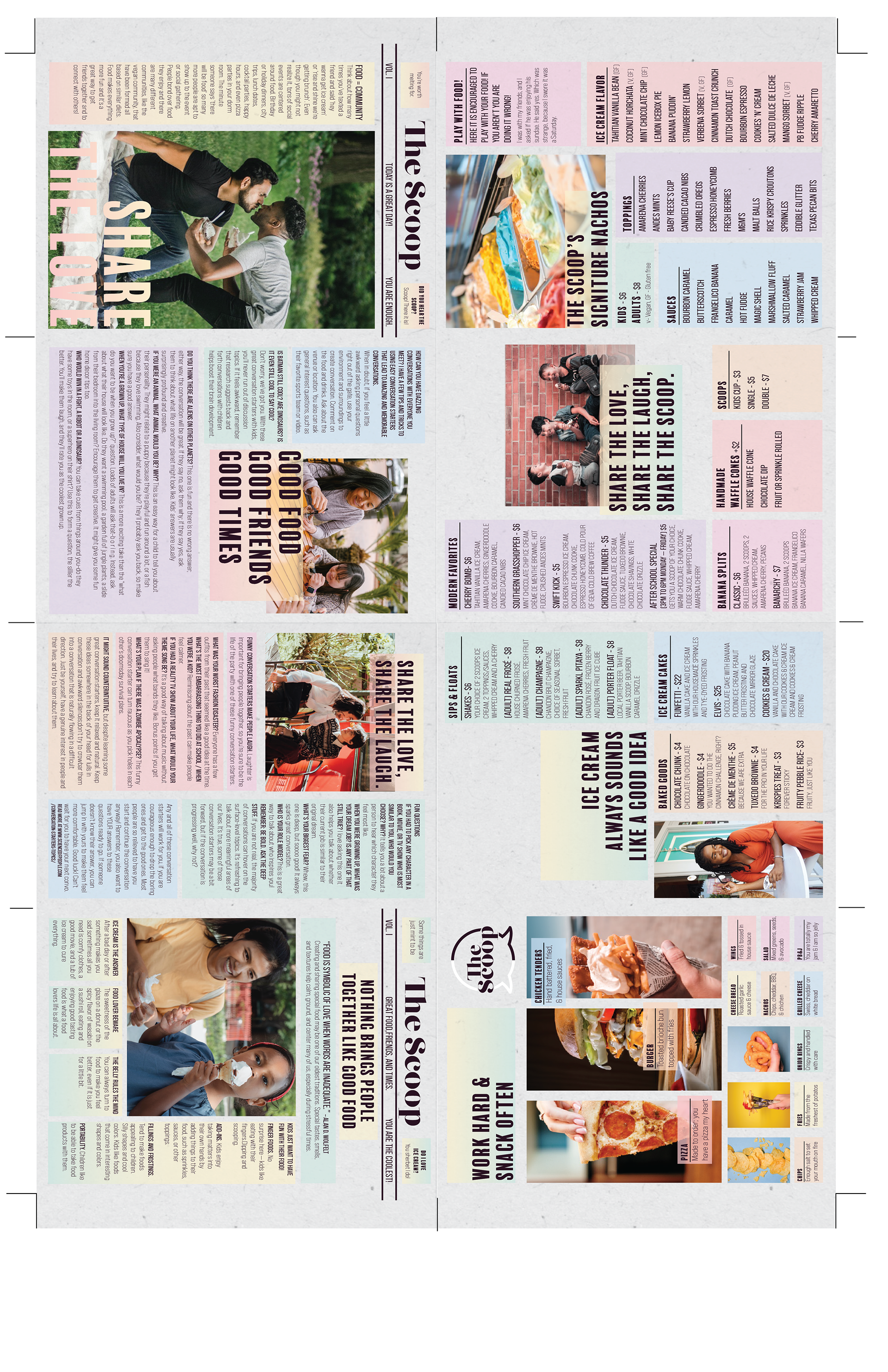
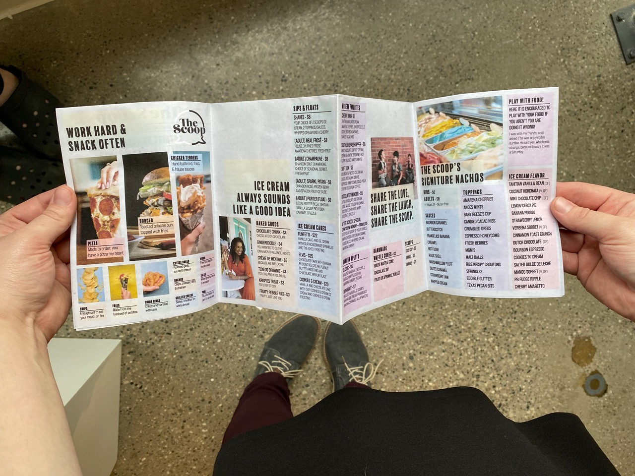
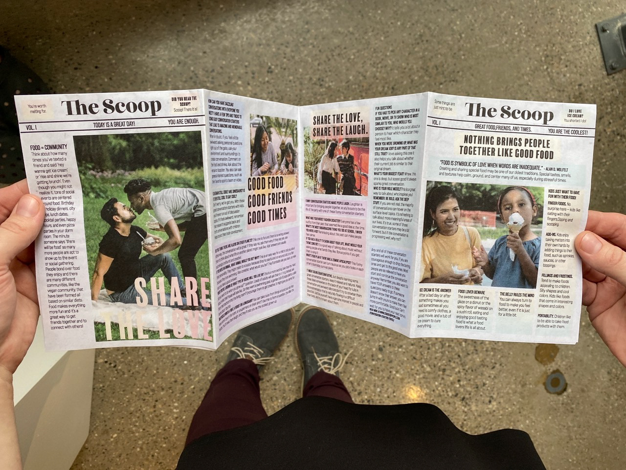
Going beyond traditional menus, I introduced an exciting twist by designing a menu that reveals a hidden gem. When flipped over, it transforms into a guide on how to have meaningful conversations with diverse audiences. This unexpected surprise sparks dialogue and fosters inclusive interactions, reflecting my commitment to DEI principles.
Going beyond traditional menus, I introduced an exciting twist by designing a menu that reveals a hidden gem. When flipped over, it transforms into a guide on how to have meaningful conversations with diverse audiences. This unexpected surprise sparks dialogue and fosters inclusive interactions, reflecting my commitment to DEI principles.



Throughout this project, I infused my designs with intention, aiming to foster human connections and celebrate diversity. I have successfully captured the essence of an everyday ice cream social experience by seamlessly blending captivating visuals, unique typography, and vibrant colors.
I demonstrated my expertise in creating compelling brand identities prioritizing human connection and inclusivity. Through captivating print ads and supporting elements, I showcase my ability to design experiences that reflect a brand's values and invite engaging conversations.
